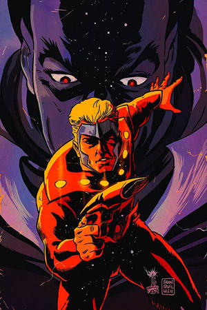
We start with one of the main reasons that virgin art variants are wonderful. On Flash Gordon: Zeitgeist #2 we see that the image is allowed to shine. The artwork is the focus and not the title of the book. There's no question who you're looking at on the cover and how big the threat he's facing is. Flash is a timeless character and instantly recognizable. It's a classic pose and 'hero line' type of framing. There's no dress needed for this to be effective at pegging the book. Ming is ever looming and a constant threat but the focus is on Flash. Francavilla's style lends to the time period (1934) and gives the sci-fi classic another overtone that really makes it pop. While the trade dress is very well done for this series, the virgin offering (no pun intended) is a fantastic piece of work.
The cover for Re-Animator #1 shows us how the virgin cover can take the known and present it as is intended. The Re-Animator is a terrifying concept. This cover blends the elements of the premise and lets them do the talking on their own. The horribly mad scientist, the mechanism of action, and the end result of the horrifying doings. It's an in your face reminder of the terror of the story involved. It also leaves it for you to see what the issue itself contains. However, there's no doubt that it's going to be icky. I mean a guy that uses chemicals to bring the dead back to life and funds the effort by selling zombie brain juice as a narcotic is only going to go further up the grisly scale.

Here, the Centipede #1 cover shows perfectly one of the biggest advantages of the virgin art cover. The limited series based on the good 'ol Atari/arcade game gives us this image. While his art adds to the success of this piece, Francavilla is able to create a very BELIEVABLY menacing creature. The impending doom comes across wonderfully and you can all but feel the dread that must be filling the poor sap front and center. With the trade dress on this cover you're reminded of what it is. It's Centipede from Atari. It's that goofy zig zagging line we all tore our palms apart trying to stop. Strip away everything and leave the art to itself though, and this may as well be an original creation from FF himself. A world full of gigantic arthropods? Ew. This variant form takes away what you know and presents the idea in of itself. Tone and intent can come across much more efficiently.
The variant cover isn't new and honestly in most cases it is pointless. The vast majority are blatant money grabs or crappy marketing tools. A good portion of them don't even make any sense. The Virgin Art Cover though, is one I actually really like. Comics are a direct expression of art. Hand crafted stories fill the pages within while hand crafted works are blazoned on the covers. Sure, not all of them work or should necessarily be given the Virgin Art treatment. However, there's a hell of a lot of them that are gorgeous.
Personally, I really enjoy a conveniently sized piece of art.


0 comments:
Post a Comment